Sarah Rogers Consultancy
Sarah Rogers Consultancy
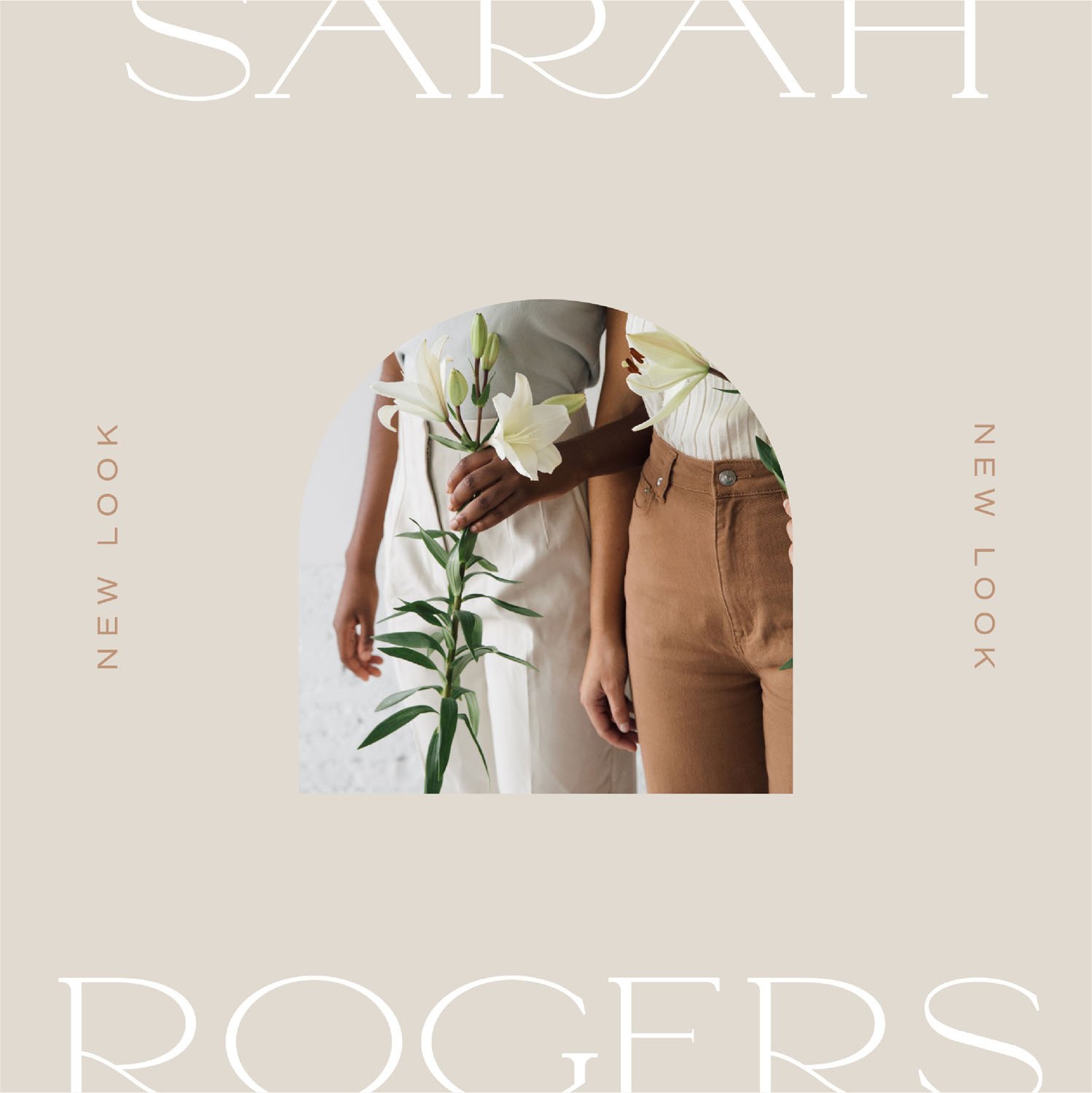
Full-Service brandingWorking with Sarah on her re-brand was truly a full-circle moment for me because she herself played a pivotal coaching role in me pursuing this dream of running my own design business. From the moment I saw her inspiration for the rebrand, I was excited and I still love the feeling I get when looking at and engaging with her brand. Her consultancy is a combination of her coaching business as well as a research business, but we wanted to look at the overarching themes and came up with this mission statement - helping passionate working individuals simplify the complex and create clear paths to wholeness.
This mission statement, the brand’s heart, really formed a core part of how all of the brand elements were designed. The 'R' and 'A' letters in her main logo have been connected with a smooth, curved line - not only does this aesthetically look clean and refined, but the connection of letters is also a nod to her 'creating clear paths' and the line it forms represents the journey her clients go on (a winding, curved path with an upward growth trend). The brand mark with two stacked semi-circles was inspired by 'wholeness' and her helping your clients to put puzzle pieces together - the semi-circles represent the puzzle pieces which, when put together form a whole and complete circle. The one semi-circle is stacked at an angle because things aren't always 'straightforward' in the process.